A couple of years ago, I started making a custom greeting card for the holidays. Little did I know, once you start down this path, pride doesn’t let you go back to a store purchased version. When you get a greeting card, have you ever thought of the amount of work that goes into making the card? Probably not. I certainly didn’t before. There are all kinds of details that are edited and scrutinized and many different variations before the final version is sent to the printers…at least that’s the case for me.
So I thought I’d let everyone in on the process I go through for making a card using this year’s variation as an example, all the way from the concept to the final product.
Every year the concept starts with a vision. This year it had something to do with me dressed up as buddy the elf, kissing a “sexy” Santa helper (my wife) on the cheek, while two elves (our children) look on in disgust. But I scrapped that idea at the last minute when I realized it would be too complicated to make the vision a reality. So instead we decided to do a card with just two elves hard at work making toys. That was the vision….this is how we got there.
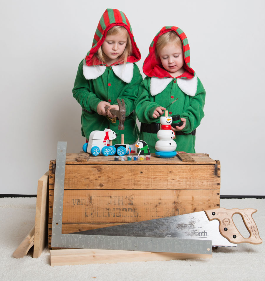
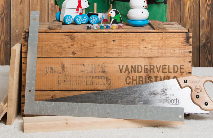
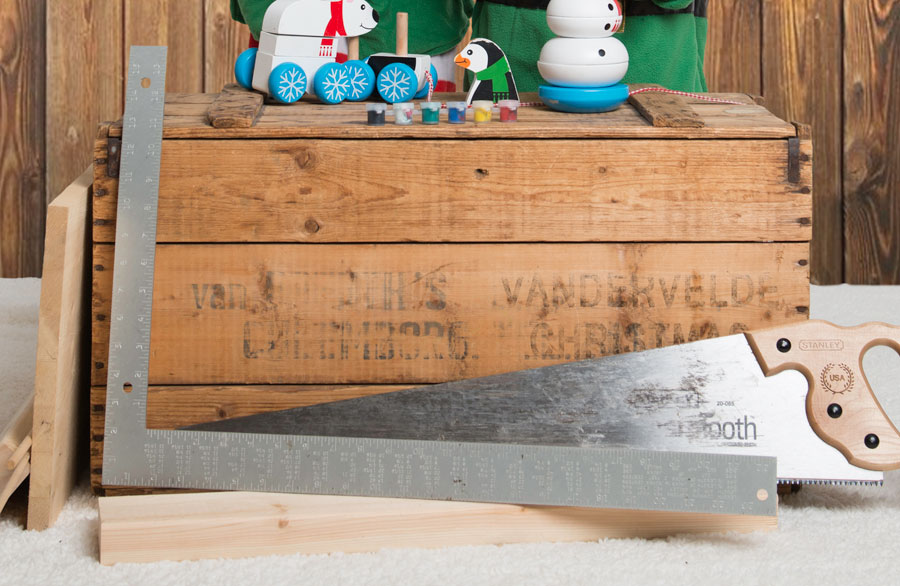
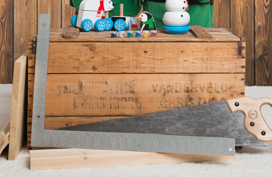
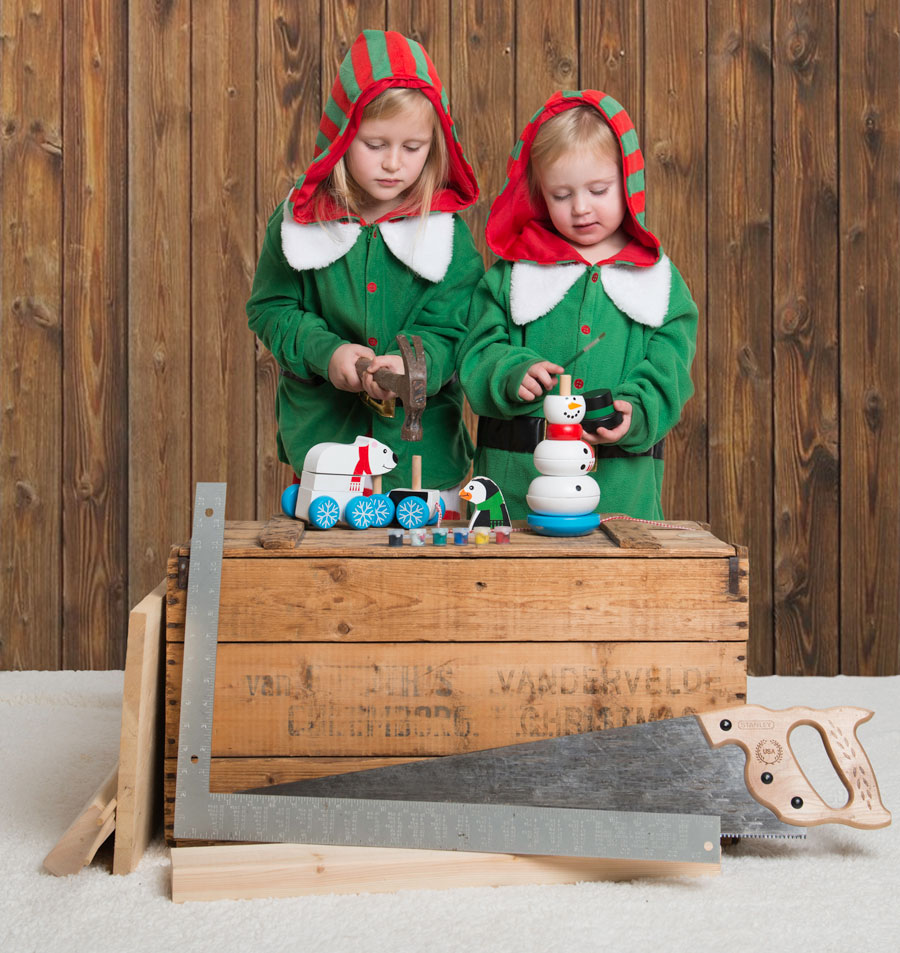
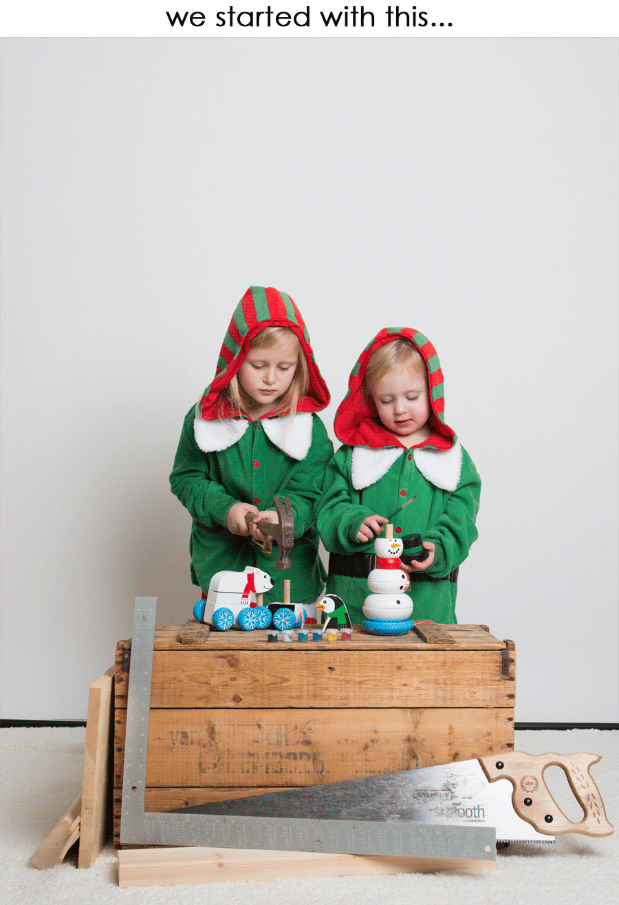
First we rummaged around and got a couple wooden toys. We used a vintage wooden box, which has been in my family for as long as I can remember, as the working space. On the newly minted work table, we placed the wooden toys on which the elves would be working. We gave each “elf” a tool—one would be hammering a dowel into one of the toys, while the other would be hand painting another toy. We added some other tools to the set, like a steel square, a saw, and some extra pieces of wood. I used a white back drop for the background (a mistake I realized in post, but more on that later) and a white blanket on the floor. Once everything was set up, in came our models and snap, snap went the shutter of the camera.
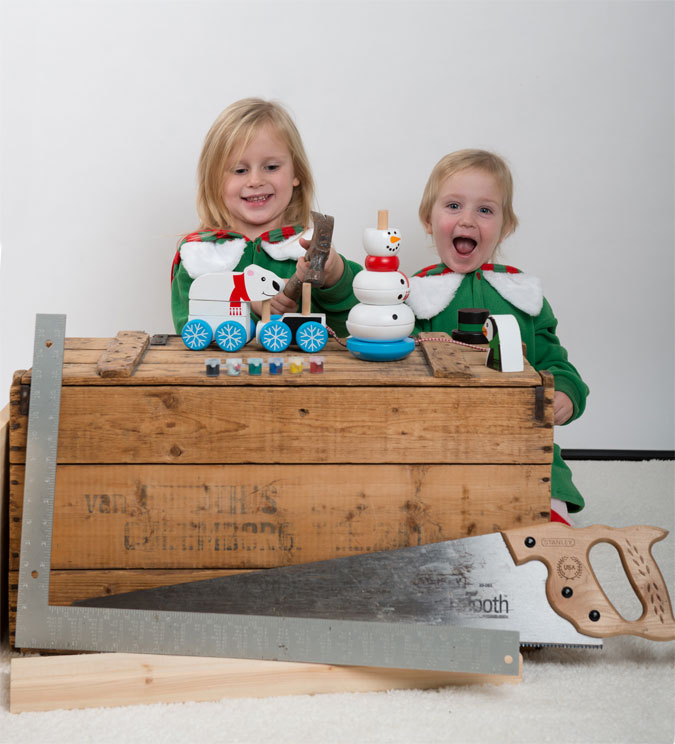
Because this shoot just involved the “models” working and appearing busy, it was pretty simple to get some good shots.

|
s | 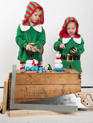
|
s | 
|
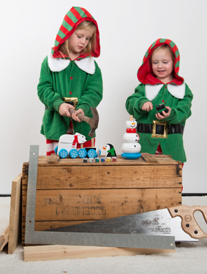

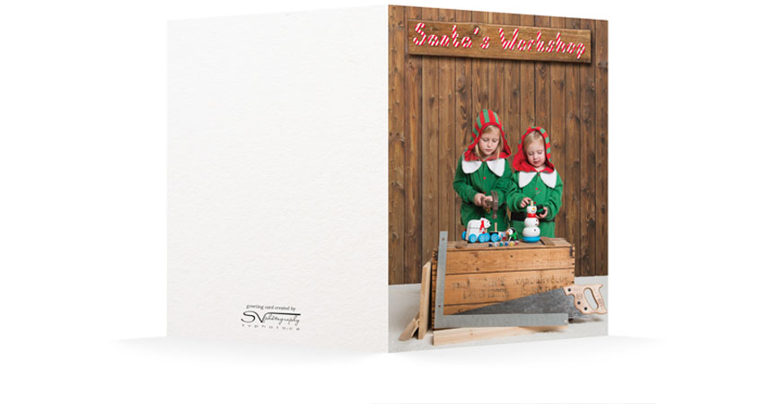
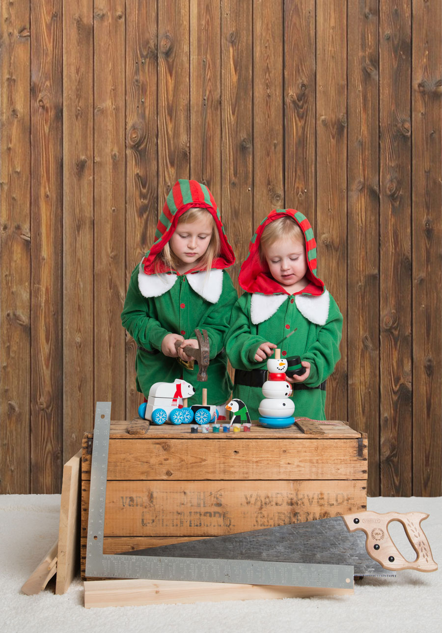
Here’s the image that we liked best and decided to use for the card.
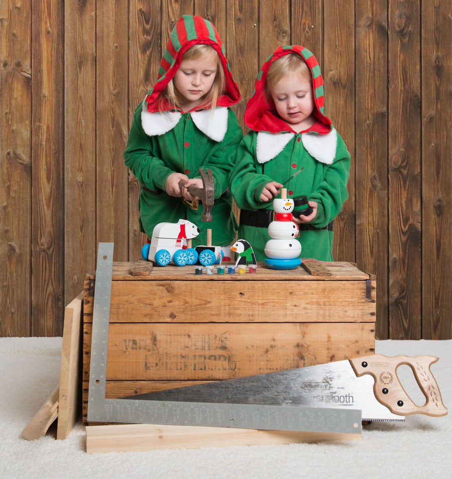
So right away I realized I didn’t like the white background. It didn’t give me that “workshop feel”. Had I noticed this detail right away, I could have used a wood back drop. But rather than doing the shoot all over again, I decided to put the wood in the background in post processing in Photoshop.
So here’s the “wood” dropped just below were the backdrop touches the white blanket on the floor.

To match the lighting in the room, I wanted some lighting fall off towards the bottom of the “wall”, so a slight black gradient was added to the background.
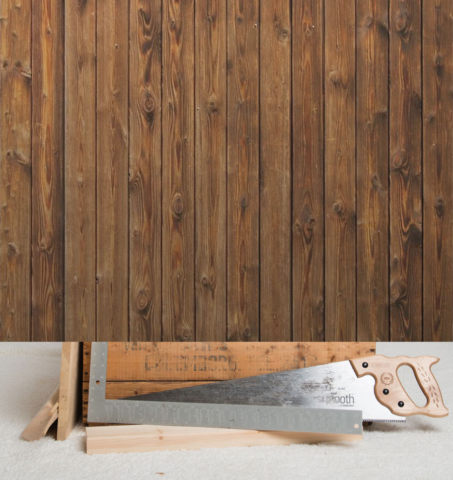
Content with the look of the wood, I used the mask tool to brush in the parts of the picture I wanted to appear, in this case, the elves, and parts of the wooden box.
Happy with how that looked I wanted to do a little tweaking to some of the elements on the front.

First the wooden crate had some faded lettering on it. I liked the look, but I wanted to add a little bit of a personal touch to it by adding my family name and the word Christmas.

It doesn’t really look like it’s actually on the box since some of the letters go over the saw. So again some masking was used to hide the letters which should be hidden by the saw.
To give the lettering on the box more of a weathered feel, the mask tool was used again along with a splatter brush with low opacity to partially remove parts of the letters, especially their hard edges.
Now the letters on the box don’t actually scream out to you, you have to really look for it to notice it. It kind of blends in the way it should look if it was really stenciled on the box years ago.
The last thing I wanted to fix on the front portion of the picture was the glare from the flash on the saw. It wasn’t horrible, but it really shouldn’t be there. So a combination of clone stamping and copying other parts of the saw was employed to hide the glare. There was some opacity of this layer so the variation of lighting would still be present, just not so distracting.
With those edits, I was pleased with the results.
But it needed something else. It needs some lettering on the top. I really didn’t want to write a long phrase, like “Elves hard at work”. I thought a simple sign board reading “Santa’s Workshop” would make everything clear just in case it wasn’t already.
So the first thing I did was find an appropriate font. Peppermint Canes looked good, so I went with that.

But I didn’t like the stripes that were generated into the font. They were all the same colour, so if I wanted it to be red, there would be a heavy stroke of red around each letter as well.
So I filled the font with a solid colour.

I then used Photoshop to create my own fill pattern using two tones of red with a green drop shadow that looks more like a stripe. I used fill>pattern to put my newly created pattern into my document.
I then selected the original letters and cut and copied from the pattern to get the new lettering with the pattern.

Just the way it was, it appeared a little flat, so a drop shadow was added to give it some depth…

along with some embossing to the top of the letters.

That was it for the lettering for the sign. But when the sign was put on the background it just didn’t look realistic.

So a piece of wood was “cut” from the background, rotated and expanded it so it would fit behind the lettering.

To match the letting, a drop shadow was added…

along with some embossing.

So that’s it. All finished. So simple right? Here is what the original picture looked like compared to the final version of the card with the completed sign.
So the card was a lot of work, a labour of love, but I wouldn’t have it any other way.
 |
s | 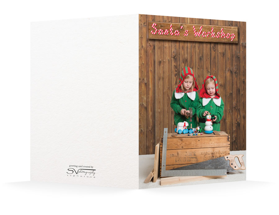 |
Share this Post